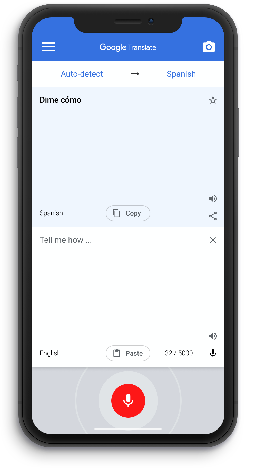
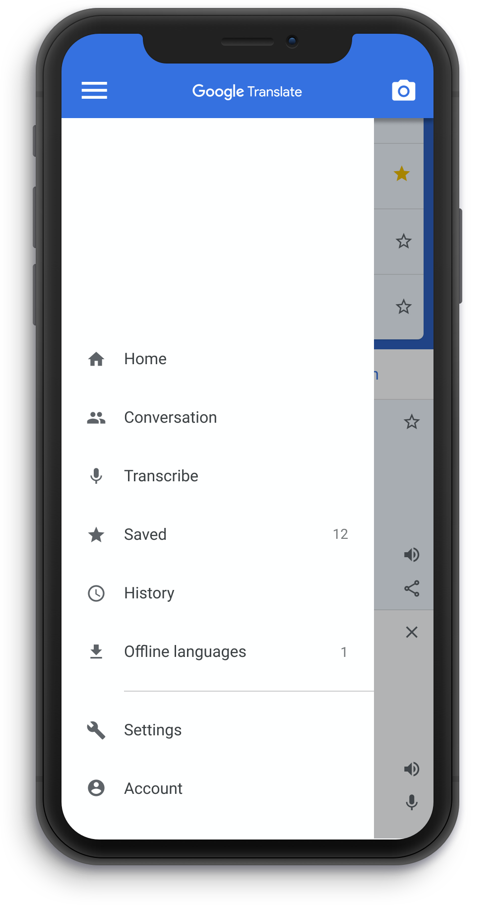
I use the Google Translate app daily and although I have great respect for Google UX, I thought I'd have a humble go at ironing out the issues I encounter as a user, while maintaining the Google style guidance.
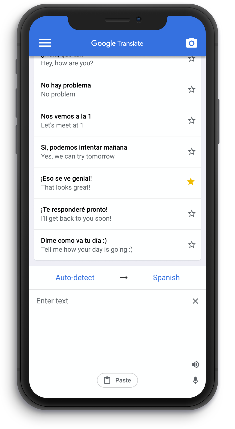
Current
The primary function, the translator input and output, is located out of reach on the current UI
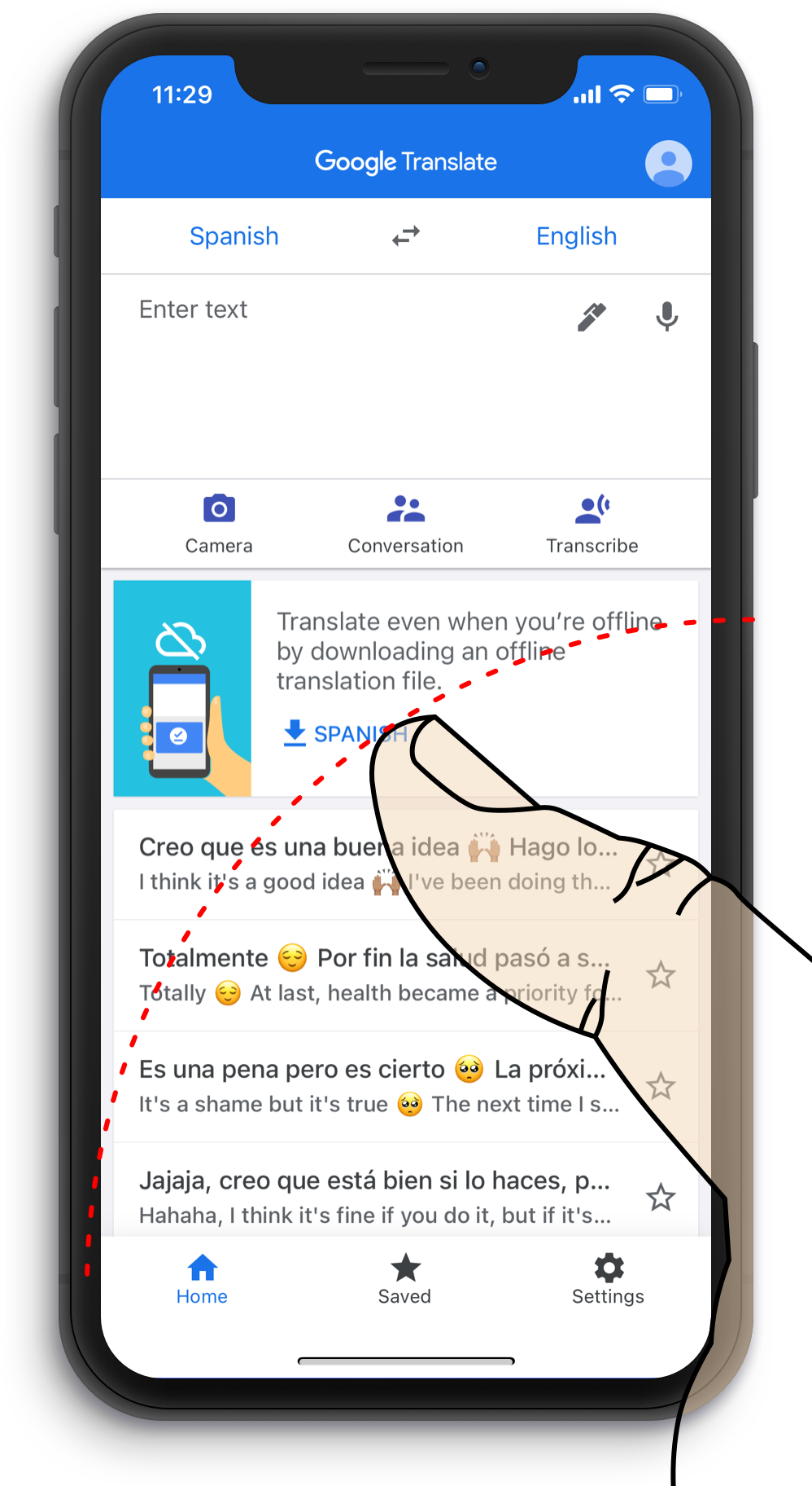
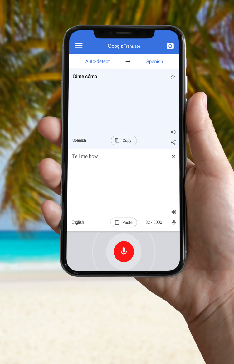
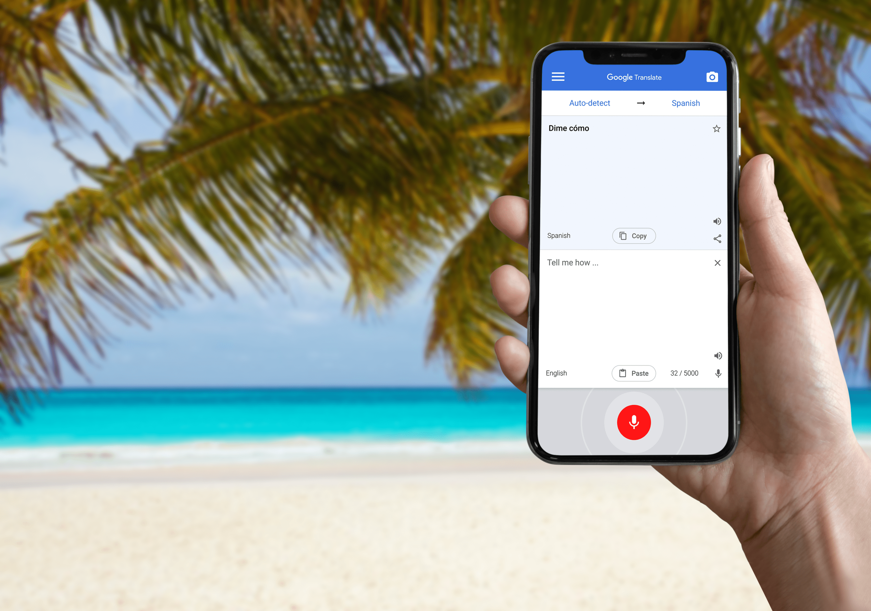
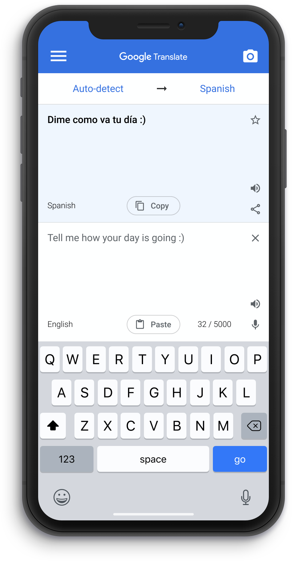
Reimagined
Reconfigured layout for better ergonomics. Paste button is predominant for added convenience
